Socratic
Problem
Regular Google search can be daunting for younger learners and Google just acquired an app called Socratic, that uses a combination of OCR, AI and machine learning to surface relevant learning resources (eg. websites, videos, links) for students.
Proposal
Rebrand the app, inside and out, as a learning-focused search by Google to be launch for students in the Fall.
My Contributions
I joind in Spring and led visual design on the Socratic team to rebrand the AI-powered app, Socratic, that help students with their homework by providing educational resources like videos, definitions, Q&A, links and more ☞ Launched Fall 2019: Google's blog and TIME. Socratic moved to the Google app in 2024.
Refreshed visual language + defined styleguide
• Rebrand the app to feel Googley and fun • Ensured the system is scaleable • Developed delightful tone and colorful for Gen Z and Alpha audiences • Harmonized with the rest of Google's products Paired graphic and text concepts across learning content Created a custom font in 2 weeks to be used for content creation
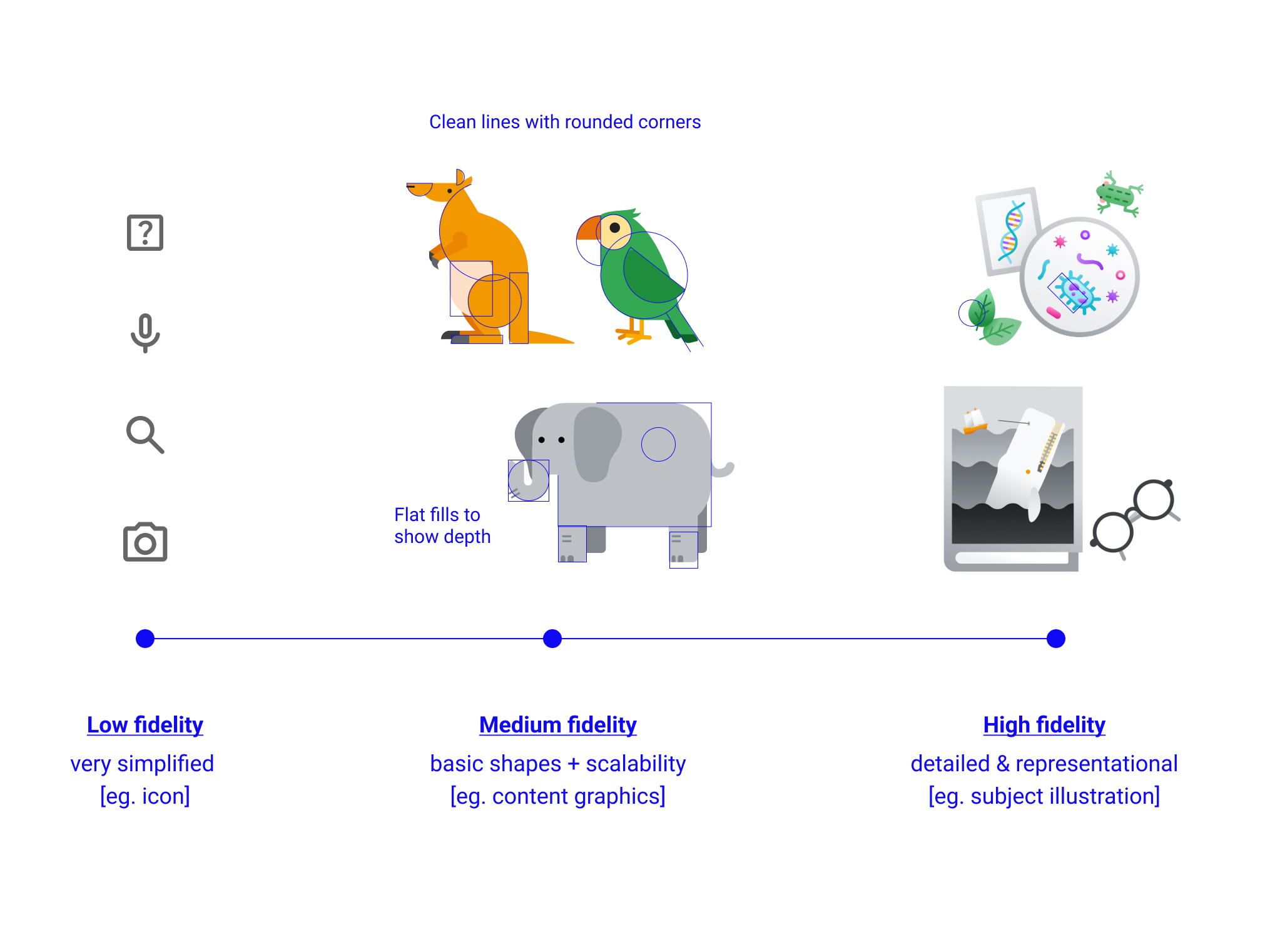
I came up with a graphic style based on fidelity and delight for Gen Z and Alpha audiences
Problem: most fonts do not offer full coverage of symbols and characters, esp. when it comes to math and the sciences. Design solution: I custom made one so the team has full control and coverage
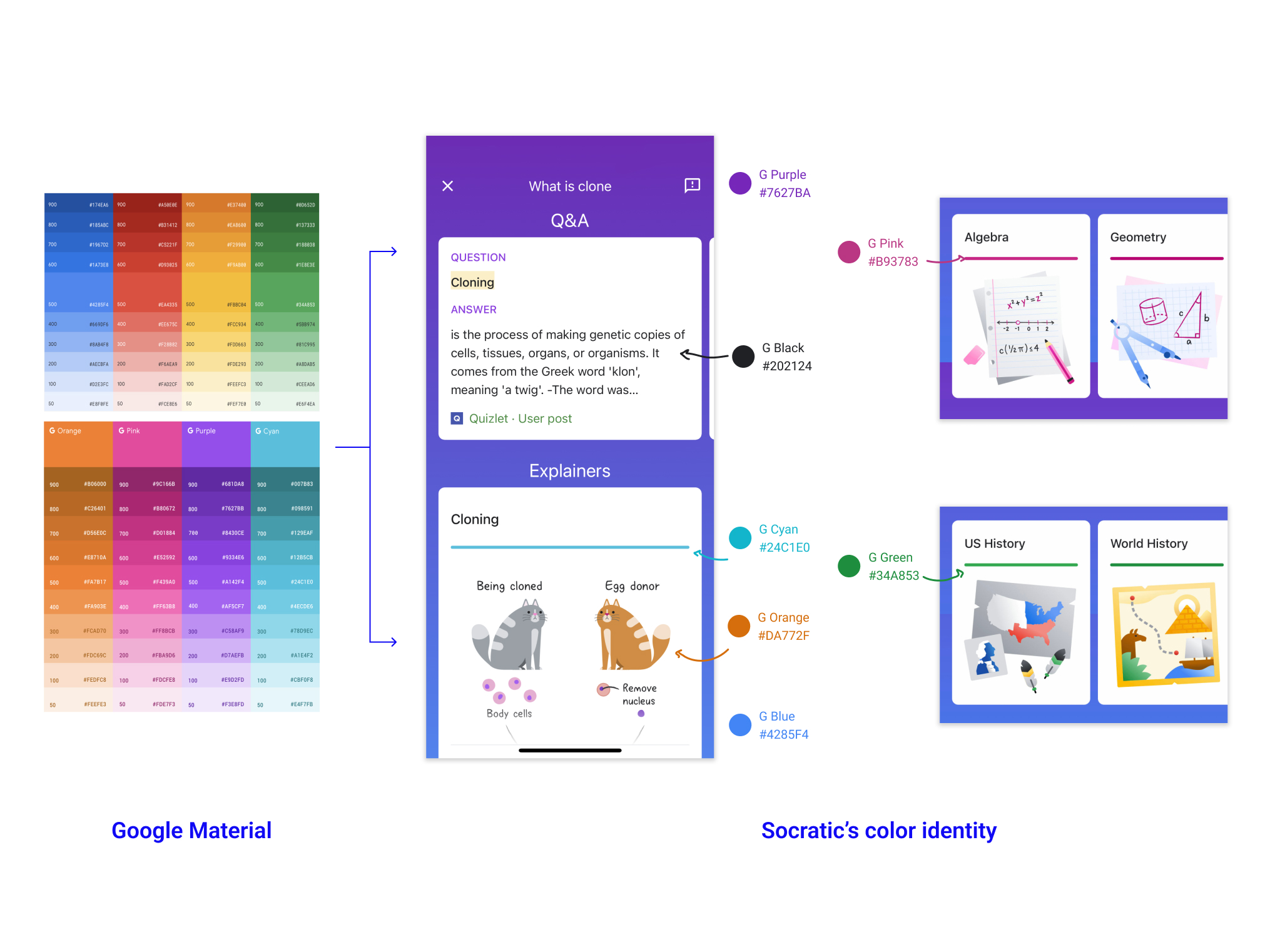
Distilled a complimentary theme for Socratic from Google Material's color guideline
Storytelling with logo
Rebooted the logo and brought that into product messaging and moments of delight
Full range of characters and strengthen brand association
Designed short animations and motion guidelines for how the logo would move
Led another visual designer and worked directly with pedagogy experts on first party content creation. • In the span of 4 months, we created over 900 explainer cards across subjects like math, science, physics, biology, and history • 30-40% of usage surfaced an explainer card
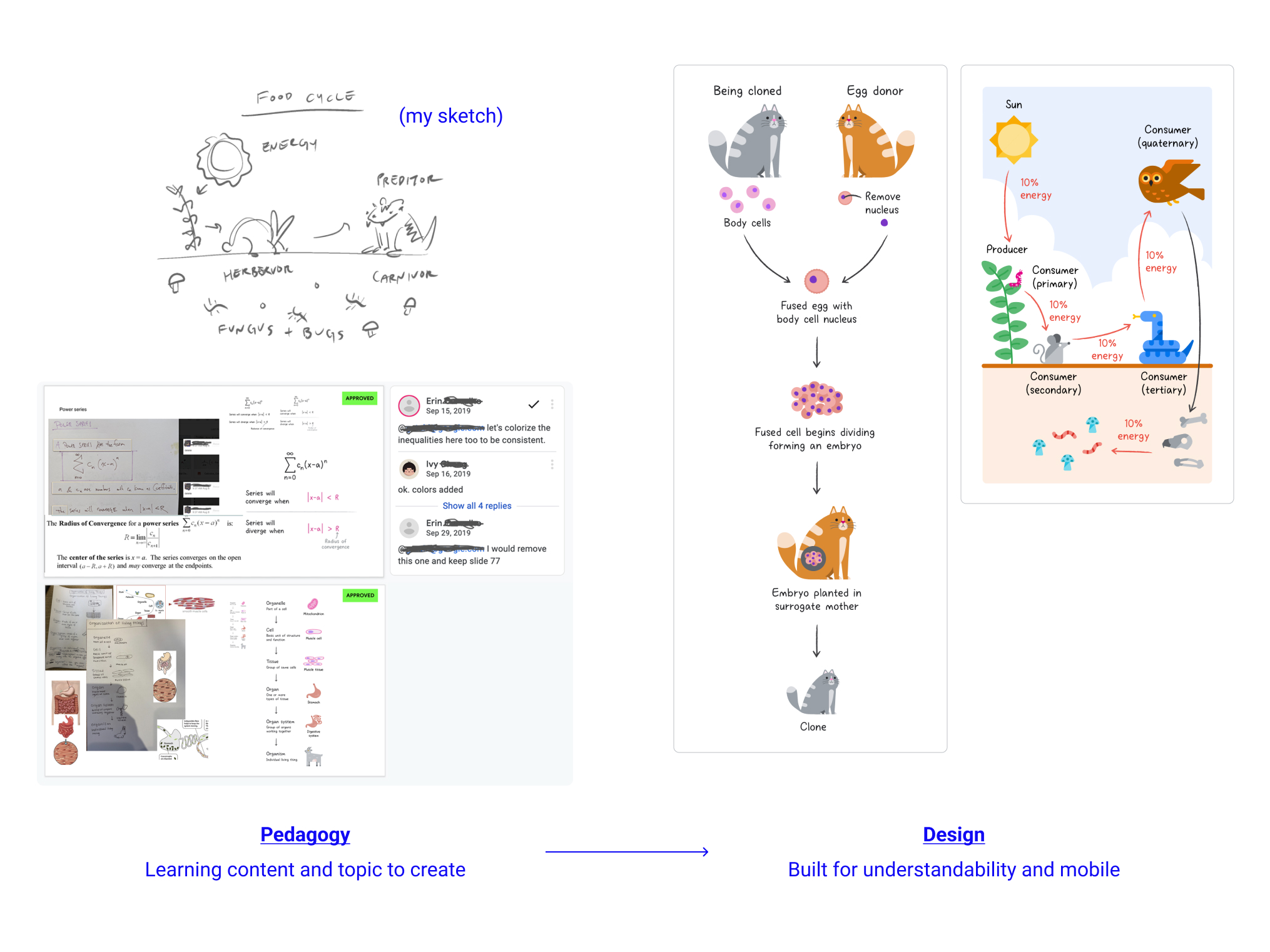
Tight loop of create, review, and QA testing
Designed for readability and understandability on vertical mobile space
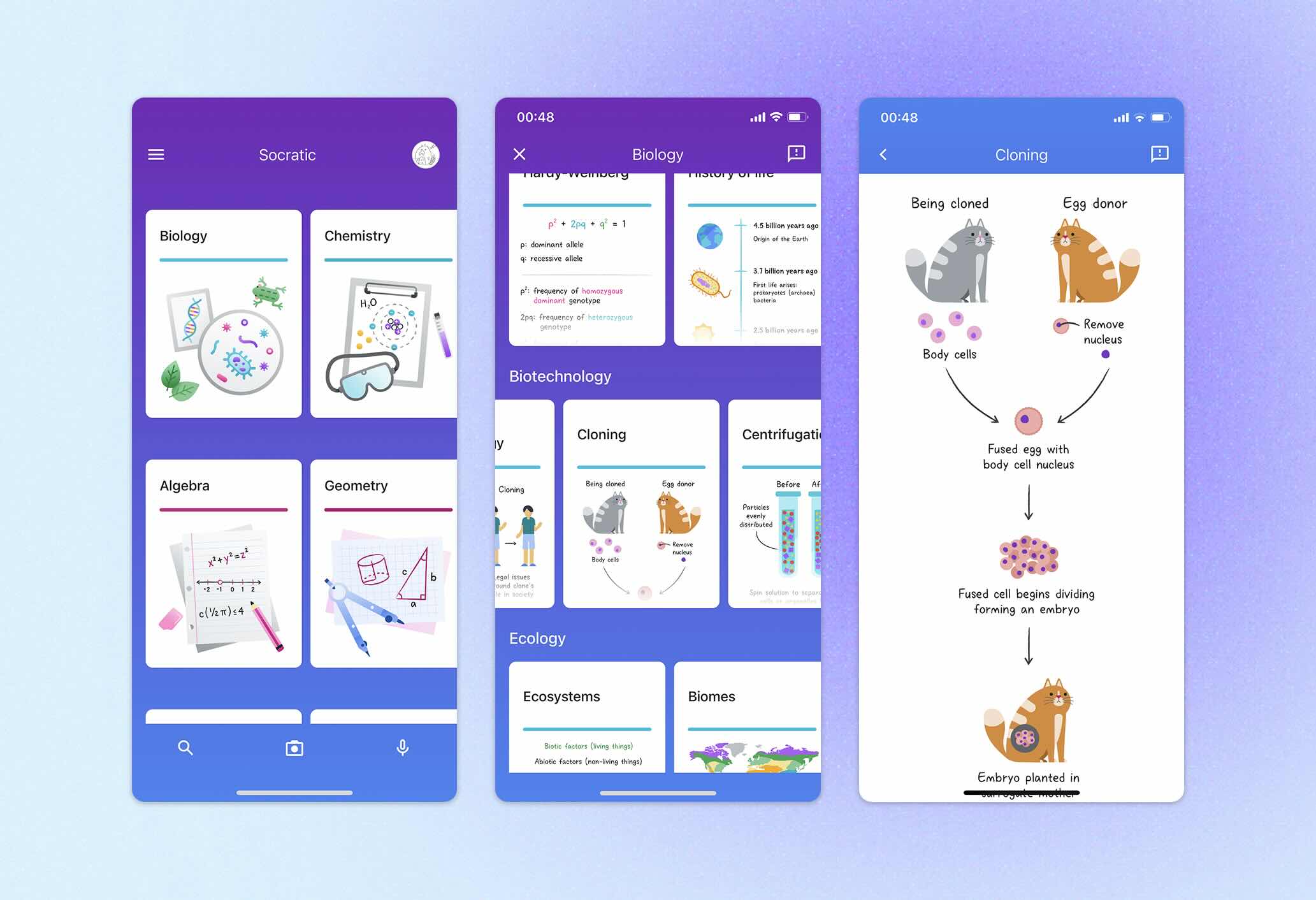
left to right: browse by subject, dive into topics within subject, detail learning about topic
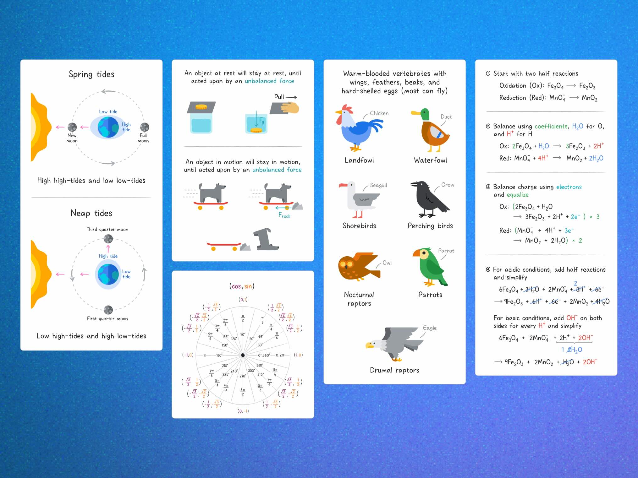
Snippet of final product
Socratic & Lens are both Google products that used camera as main source of input. Problem: sometime, the OCR (Optical Characrer Recognization) technology would fail. This caused students to get stuck in their end-to-end journey or experience bad query results. Design solution: led design work and cross-team alignments on a custom math keyboard so that students can manually address OCR errors
Adoption into Google Search (eg. search math solver) in 2025
Most digital mathematic symbols are rendered using LaTeX font Rendering with LaTeX has its limits: • The font showed up wonky when applied raw against the native system font • LaTeX was not designed to be interactive Design solutions: Recycled LaTeX to create versions of symbol made for editing • Testing the cursor movement implementation • Turned to UXR with studies on cursor and keyboards (mobile UX)
Closely collaborated with engineering to implement and troubleshoot functionality
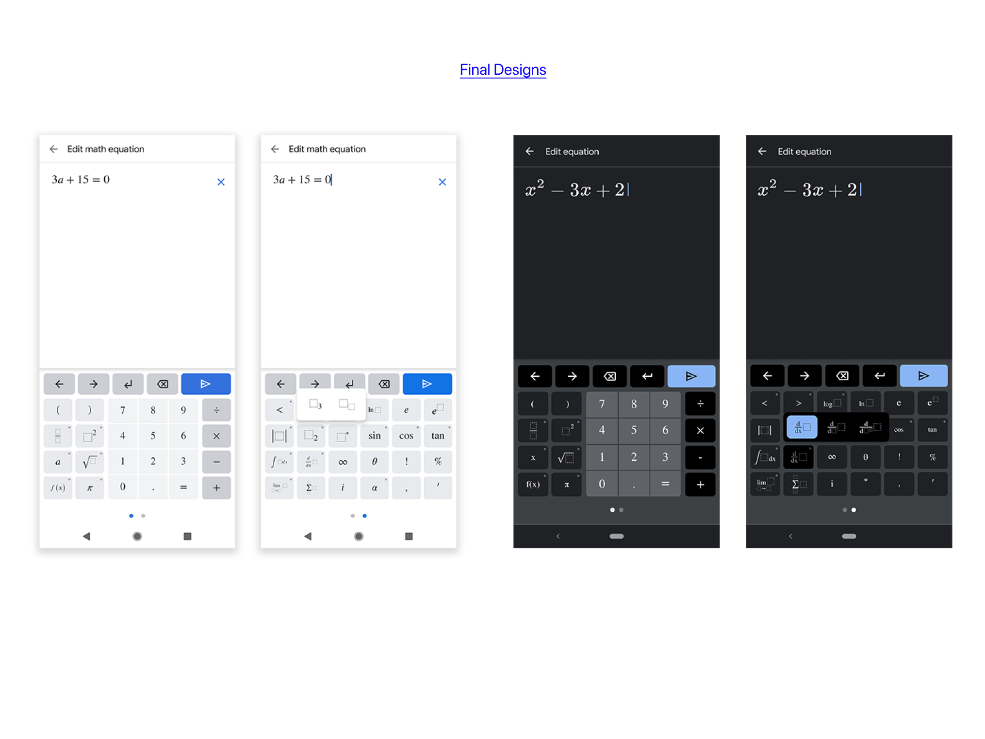
Snippet of final feature released on Lens in 2020